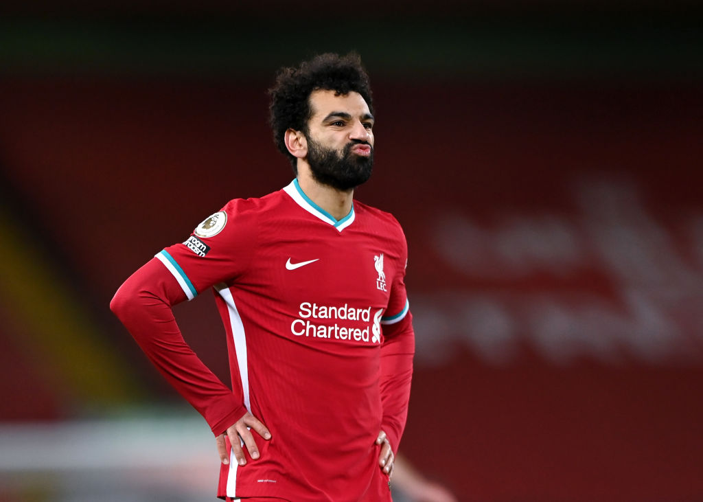


Liverpool fans have taken to Twitter to react after Footy Headlines revealed that Standard Chartered are changing their logo ahead of the 2021/22 season.
Liverpool’s shirt sponsors have adapted their logo slightly, so that the font of the writing has changed, as has the location of the emblem.
Standard Chartered’s emblem now sits on the opposite side of the writing, while the font has taken a looser, less rigid appearance.
It’s hardly groundbreaking news, although it will don the front of the club’s shirts for the remainder of the company’s contract with Liverpool.
In that respect, it’s going to be a big deal for those who don’t like it.

Judging by the responses below, there’ll be a few of the Anfield faithful who dislike what Standard Chartered have done.
One supporter said it looks ‘terrible’ while another felt the new logo looks ‘hideous’ – another fan said it was a ‘horrid’ modification to the shirt.

Another went as far as calling it ‘shocking’ – it really hasn’t gone down well.
The rebranding was made official by Lippincott a few days ago, who posted the new logo on Twitter.
Let’s see what the Liverpool fans on Twitter think of the new detail which is set to sit front and centre of their shirts from now on…
Receive exclusive football transfer news and updates twice a week to your mailbox